PROBLEM: An internal American Express website was being taken advantage of by the public. We were tasked with solving the problem by expanding on the necessary credential requirements to limit submissions to Amex employees.
BEFORE
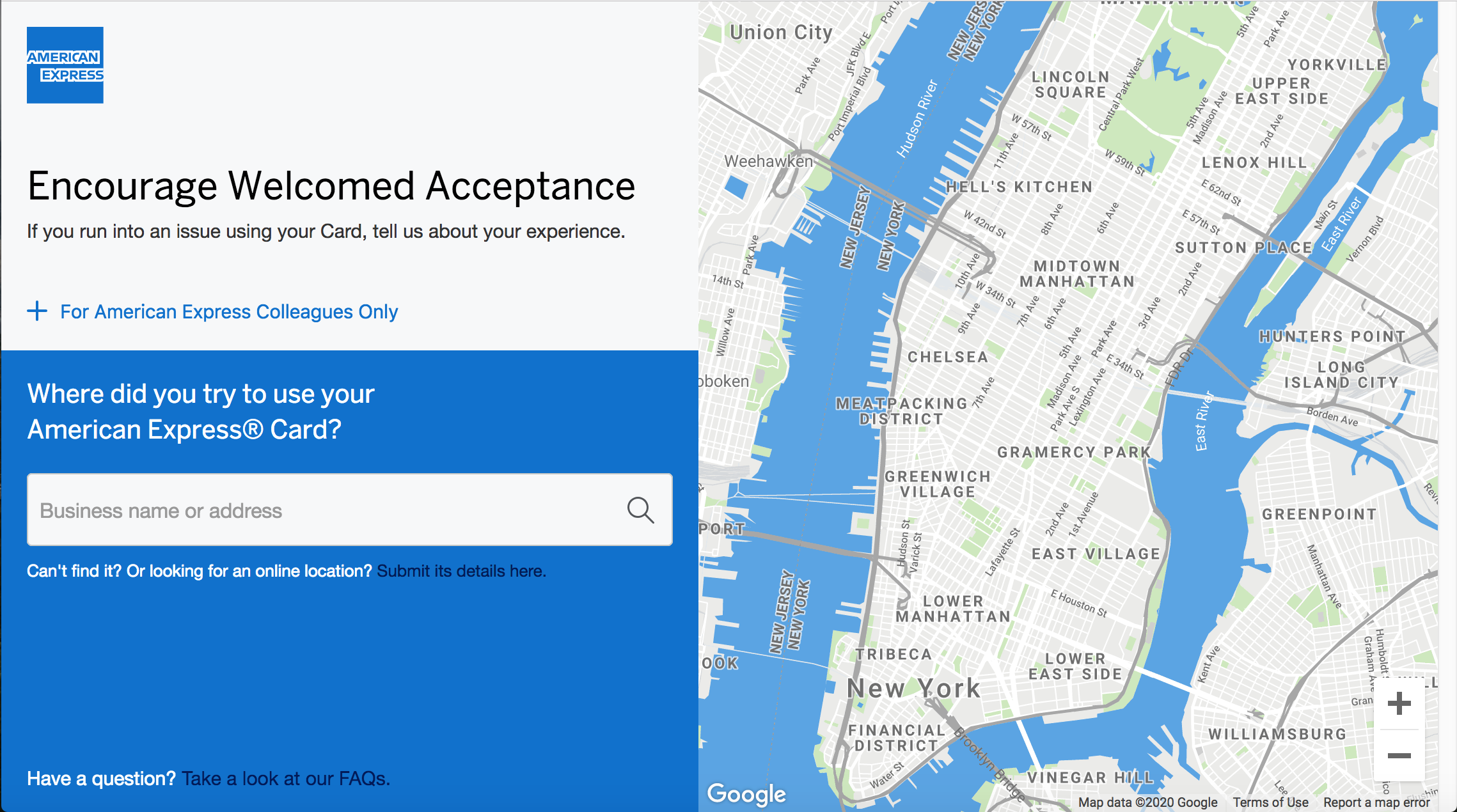
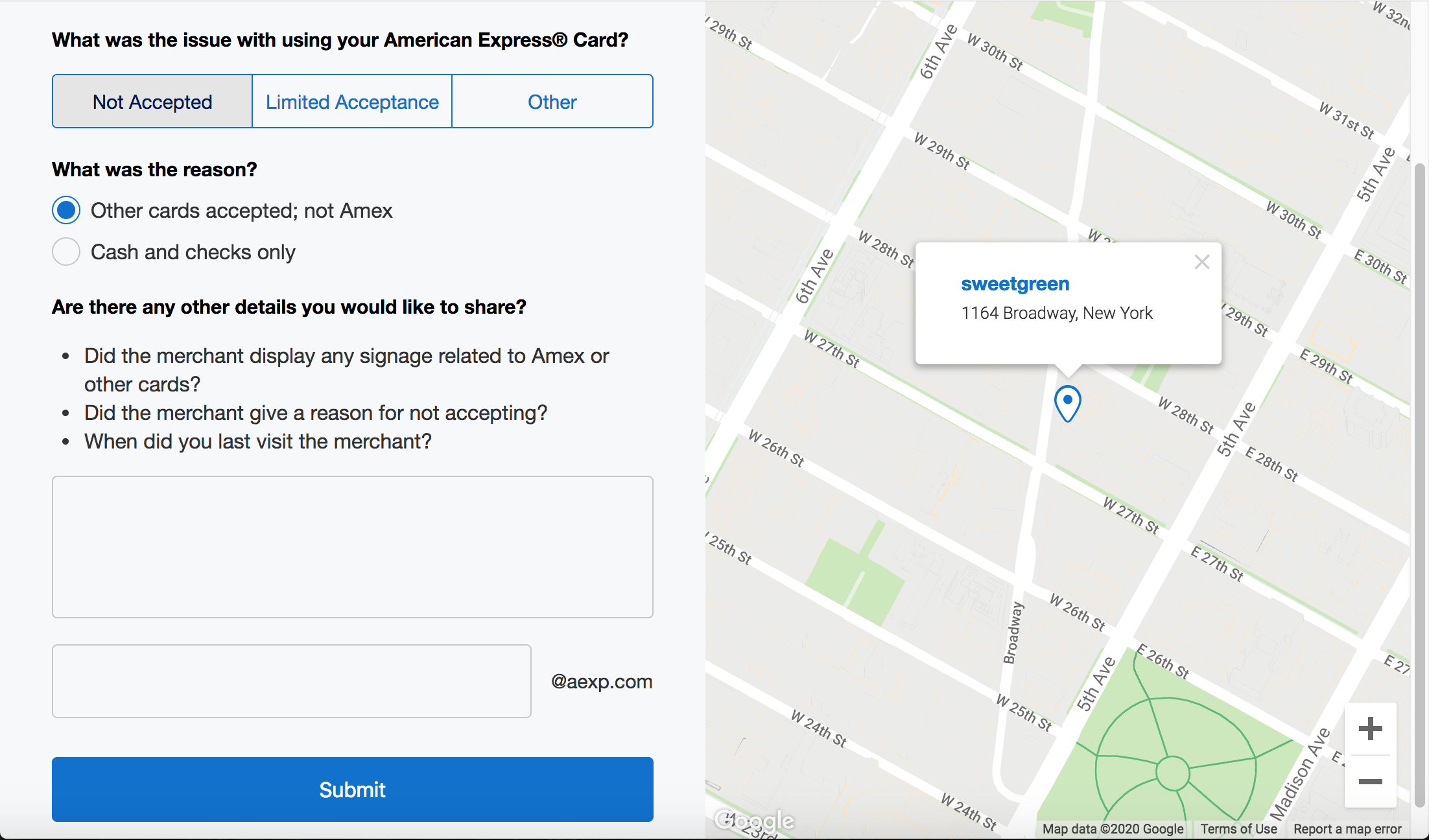
This site was designed to report issues with using your Amex Card at a business that normally accepts them. The first page allows you to search for the business by name. Users then gave a description of what happened on the second page.
With this design, there isn’t a lot of clear signs to users that this site is for Amex employees. What made the problem worse was that the only credential needed to submit a complaint was an Amex corporate email address.
AFTER
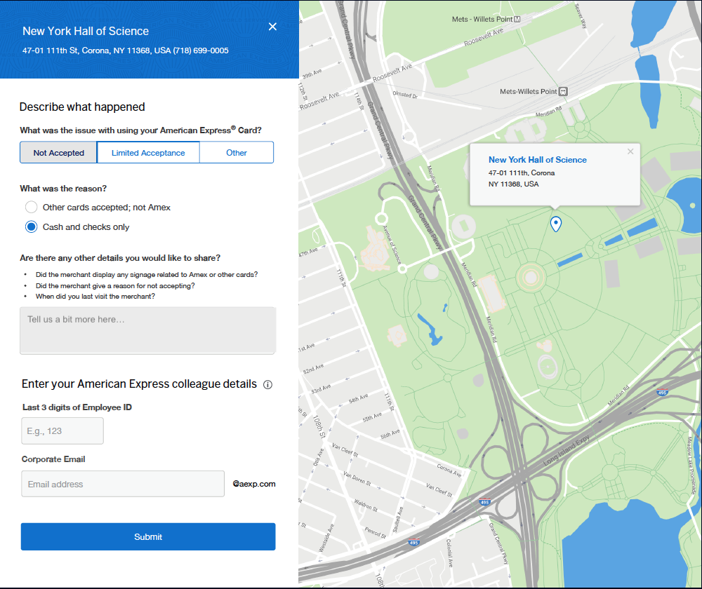
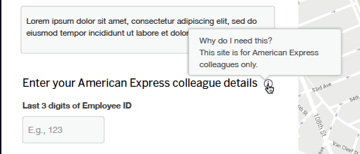
With this new design, we included a new header in the lower half of the submission form that clearly lets any stray users know that their submission requires Amex credentials. We also built in a tooltip that provides more clarification. Finally, the client requested that we include an additional text field for employee ID numbers, which we added with appropriate hint states to help reduce the cognitive load.
FINAL THOUGHTS
The client only asked for changes to the second page of the user flow (where Amex employees submit their information) by adding the additional employee ID input field. While we were glad to make this change, my designer and I both agreed that the whole process could have been updated from beginning to end, since the initial landing page doesn’t make it especially clear that site access was limited to Amex employees. We also pitched breaking up the submission into two pages rather than just one so that the user knew very clearly what was required, however this was not a direction the client moved forward with.


